Interactive Header
Introduction
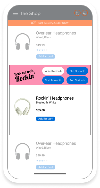
Interactive Header is a horizontal Commerce Display unit that consists of a Branding Zone with up to 4 product buttons and a Product Zone that displays the selected SKU.

Example of the Interactive Header Ad format
This format corresponds to the mobile version of the Butterfly display unit. For the sample API response and desktop version, please refer to Butterfly.
Specifications
General

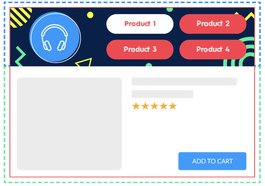
- This unit is composed of two parts:
- The branding zone on top (blue dashed line),
- The product zone below (green dashed line).
- The format must be able to host up to 4 different products.
- The user can change the displayed product with product buttons.
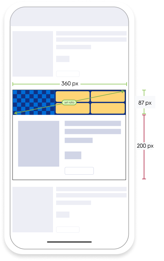
- The branding zone width is equal to the product box width and scales in proportion. The background and logo images are never cropped.
- The product box is created according to the mockup.
- The logo image can be clickable and contain the redirection (a CTA button is usually added to the logo image to indicate to the user that it is clickable, and the button is part of the image, not a coded element). The entire logo image (
460x300px) will be clickable.
Asset Sizes
- The entire interactive header banner is composed of 2 images:
- The logo image (
460x300px) - The background image (
1242x300px) - The logo is not mandatory, but the background image is.
- The logo image (

Available options
Redirection
- At the banner's click, it redirects to the link defined in the response.
- There are two redirection options
_Self_(redirect in same tab)_Blank_(redirect in new tab)
PDF file upload
- A brand may choose for the CTA to result in a file download. This file will be included in the ad response.
- At the banner's click, a PDF file opens like a redirection link with both
_Self_and_Blank_options (see above)
CTA buttons
The banner will look like the following with the CTA button (with four buttons, three buttons, two buttons, no button).

Example of the Interactive Header layout with different number of CTA buttons
Technical details
- The entire interactive header background is composed of 2 images
- A logo image (ratio
1:5;3) - A background image (ratio
1/4.14)
- A logo image (ratio
- It's possible to have up to 4 product buttons (1 button per product). The number of product buttons depends on product availability.
- When only one product is available:
- There should be no button displayed,
- The logo image is centered on the horizontal axis of the design portion (see the image below).
- There is a
2pxborder around branding and product zones. - Product buttons:
- Button font size:
2,3 vw - The text can be over two lines long, and in this case should have a line-height of 1.
- It's possible to have two colors for background buttons: one for hover (selected) and another when not selected.
- Button font size:
- Button placement:
- Each button should have a width and height equal to 50% of the button zone.
- There is a margin of
1vwbetween each button, and between each button and the border.
- The background image position is fixed, and the image is never cut. It scales in proportion (when the width reduces, the height reduces as well).
- The displayed banner size depends on device. The image logo ratio and background image ratio remain the same.

Implementation example
Updated about 13 hours ago
What’s Next
