HomeGuidesChangelog
Log In
Guides

Digital Shelf Talker

Specifications for the Digital Shelf Talker Ad format

Introduction

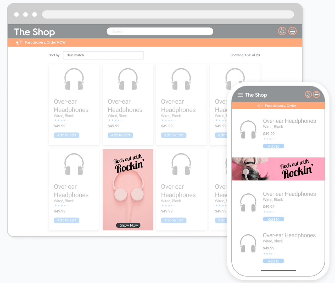
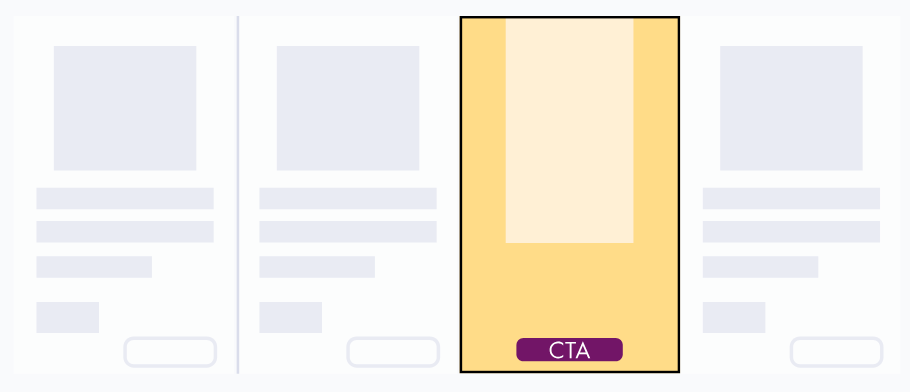
Digital Shelf Talker is a responsive vertical display banner with a still image and a redirect link.

Points to remember:

  • Available within the grid.

Redirects to 1 URL:

  • On desktop via Branding Zone and call-to-action button,
  • On mobile via Branding Zone.

For desktop

Asset sizes

  • Background imageis 310x500px with fixed safe zone of 180x320px
  • Background image smallis 270x390px with fixed safe zone 180x190px

Please note that only one of these size will be used once it is chosen.

Background `310x500px`

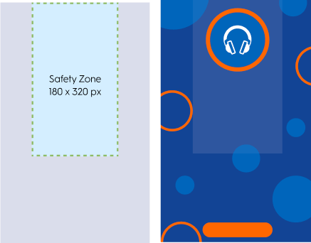
Background 310x500px

Background `270x390px`

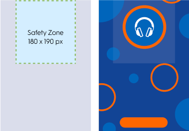
Background 270x390px


Technical specifications

  • The branding zone size is equal to the size of one product tile.
  • The redirection link (URL) is mandatory. The entire image will be clickable. It's possible to have the redirection happen on the same page (_Self_) or in a new tab (_Blank_, not applicable for App). A redirection button (call to action) can be added as well.

Call-to-action specifications

  • Button size: 150x30px
  • Button font: Roboto Regular, 12px
  • The gap between the options area and the bottom of the branding zone is fixed to 7px
  • There is a safe zone at the top of the format. This area should remain visible for every breakpoint.
  • If the branding zone is smaller than the background image, then the image should be cropped on both sides uniformly and/or at the bottom.
  • If the branding zone is bigger than the background image, the extra available space is filled with a plain colored background (CSS).
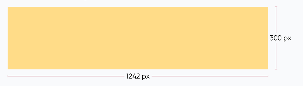
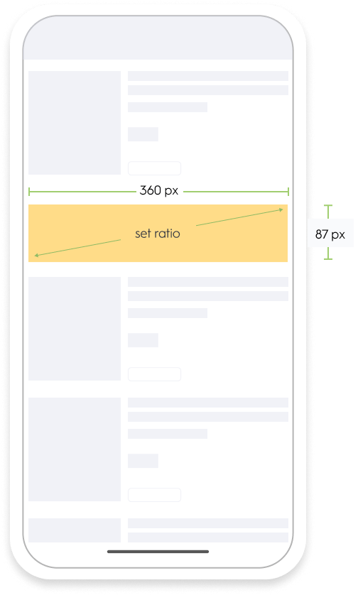
For mobile

Asset size

  • Background image is 1242x300px

Technical specifications

  • The entire format should be clickable
  • The creative width is equal to 100% of the parent div and scales in proportion. When the width reduces, the height reduces as well. The background image should never be cropped.

Response keys

FieldDescription
desktop_background_imageURL of Background image file for desktop
desktop_background_image_alt_textAlternative text for desktop background image
mobile_background_imageURL of Background image file for mobile
mobile_background_image_alt_textAlternative text for mobile background image
background_colorBackground color hexa code of the creative tile
redirect_urlWeb URL that the user should be redirected to
redirect_url_appApp deeplink that the user should be redirected to
redirect_targetRedirection target, can have the following values:

- _blank: redirects to a new tab
- _self: redirects in the same tab
(only applicable for web)
footer_textButton text
(not applicable for mobile version)
footer_text_colorButton text color
(not applicable for mobile version)
footer_background_colorButton background color
(not applicable for mobile version)

Sample response

{
    "status": "OK",
    "placements": [{
        "viewSearchResult_API_desktop-inGrid": [{
            "format": "ST",
            "products": [],
            "rendering": {
                "desktop_background_image": "//crtormassetmguseprod.blob.core.windows.net/creativeassets-live/try44gf6h46tyu4yj46gfh64fg6h4rt46r78t8rfb4cdf178378c.jpg",
                "desktop_background_image_alt_text": "//crtormassetmguseprod.blob.core.windows.net/creativeassets-live/try44gf6h46tyu4yj46gfh64fg6h4rt46r78t8rfb4cdf178378c.jpg",
                "mobile_background_image": "//crtormassetmguseprod.blob.core.windows.net/creativeassets-live/try44gf6h46tyu4yj46gfh64fg6h4rt46r78t8rfb4cdf178378c.jpg",
                "mobile_background_image_alt_text": "//crtormassetmguseprod.blob.core.windows.net/creativeassets-live/try44gf6h46tyu4yj46gfh64fg6h4rt46r78t8rfb4cdf178378c.jpg",
                "background_color": "#ffff00",
                "redirect_url": "https://www.criteo.us/p/salade-batavia-3000001ffgghjhg040194",
                "redirect_url_app": "app redirect",
                "redirect_target": "_self",
                "footer_text": "click here",
                "footer_text_color": "#FFFFFF",
                "footer_background_color": "#2A3279",
            },
            "OnLoadBeacon": "//b.us5.us5.us.criteo.com/rm?rm_e=gU6UTFHZRX8h%2bLm%2fgfardqYNcwv1OkAlS4Ip1Go8pZDMgtJ9b6J28QWdhsC2nAZTzLCJmI3i486hJaSNb8JMQcCSlgYxB4OSIhR%2bzYBx9jpKqNjHfVQcNiNKp8NNaSTu3BnA23%2fpeljDGSOjBFZEddfotGA1NP%2bVCC8JJMGfgh2n1uJxTdGoTrkriygDOy0iz7qAwf7sj%2bctHKVa2suRSe2ZRLawkZfztW231Vcw3xn0FTPeKbhdhjYGBzNKs%2fkUbP7Q0bLzX0s4WqAqMzV1IppHg%3d%3d&ev=2",
            "OnViewBeacon": "//b.us.criteo.com/rm?rm_e=qK9HLTImiTHdD5zv6c%2fcyCgOlBfgaplqmu0CkokA1jIrovi4qrVG%2bibqys%2b8SojsJTKuZ28LCqGFUlSdX0013z8m%2frmJhXcnM2bq0V4DSDewNZWUmVGudiBAY8mrK9CB0f0DjKkrhy7tDGmjSiJJgTqLzxIOYAoCQaj664x%2fZVdfgh4RsNU%2fcgtoYMcAI%2fDmZrmoxbPhzH8EFx%2bkm2My4dfHd9MFyuTmDhGLpM3FAhsqdDVD1bKwNJH49PXo2iGztiD&ev=2",
            "OnClickBeacon": "//b.us5.us.criteo.com/rm?rm_e=rjTAB7fXC6J7S%2f8%2bT2IIaMHIMdg9LvCYDHSuka%2bOdx2dEzgUby%2f9fJGwebUZgEoQa2Ecm6RqVonJcN52%2fiwK87d5HxbrfghxGLpGXueXg5ioxvfsm9%2bZ9JHfmCa7zu8QgVRk7Qtq1Kb28gX2%2fup3jaCCckAjMxxgplInlqBxUZ7LRXmqYr8HUrKsTZoYlxmt9s56OaHXEW9YvGeQpou%2fsJjilzmjXb7AJOrndW5ch0TX4G2zZ4qaJyKPuBgl4t1CjHH&ev=2",
            "OnBundleBasketChangeBeacon": "//b.us5.us.criteo.com/rm?rm_e=yVma5fEYR2%2baGTU2mFoD1qSImhAifgUXBh4kE5yCe2a%2fiMcLRlrG%2bA1DuZZlyVFolE%2bBYhimashpJaYNhmBEhbLLSbPIcm35fghNjyhlND50SEwwUwMFYfY58Qmnec3wOjPp%2bwfdH7GDA6fnCP6Yg8N%2flhIlc1bwhNle%2bboNzAfTWEKgv8dM3m%2bYvV5TbXB0W8GHbINKwMwY6nzhU2uKklutTRQTPoxj4kGFfK70Oyx23rd6j3r2864Pl3TLsB6QD1Y&ev=2"
        }]
    }]
}

Implementation example

The example below is available for preview on this page (CodePen).

<div class="crop-wrapper">
  <div class="rm-format" data-type="ST" role="region" aria-label="advertisement">
    <div class="rm-desktop-creative">
      <img src="https://i.postimg.cc/7P3PynZ3/BTF-500.png" 
           class="rm-desktop-backgroundImage" 
           alt="Branding Image">
      
      <div class="rm-dimensions-overlay rm-desktopDimensions">
        <span class="rm-width"></span>
        <span>x</span>
        <span class="rm-height"></span>
      </div>
      
      <div class="rm-option-container">
        <a href="https://example.com" target="_blank" class="rm-option">Shop Now</a>
        <div class="rm-option-legal">
          Lorem ipsum dolor sit amet, consectetur adipiscing elit. Integer vel metus erat. Fusce in.
        </div>
      </div>
    </div>
  </div>
</div>
.rm-format[data-type="ST"] {
  display: flex;
  flex-direction: column;
  position: relative;
  margin: auto;
  border: 1px solid #ddd;
  overflow: hidden;
  margin-top: 5%;
  width: clamp(180px, 40vw, 330px);
  height: clamp(320px, 60vw, 520px); 
}

.crop-wrapper {
  width: 100%;
  max-width: 100%;
  margin: auto;
  overflow: hidden;
  display: flex;
  justify-content: center;
  align-items: center;
}

.rm-desktop-creative {
  position: relative;
  width: 100%;
  height: 100%;
  background-color: lightblue;
  display: flex;
  flex-direction: column;
  justify-content: flex-start;
  align-items: center;
  box-sizing: border-box;
  overflow: hidden;
}

.rm-desktop-creative img {
  width: 310px; 
  height: 500px;
  max-width: 100%;
  max-height: 100%;
  object-fit: none; 
  object-position: center;
  display: block;
}

.rm-dimensions-overlay {
  position: absolute;
  top: 50%;
  left: 50%;
  transform: translate(-50%, -50%);
  font-family: Arial, sans-serif;
  font-size: 12px;
  color: white;
  background-color: rgba(0, 0, 0, 0.7);
  padding: 6px 12px;
  border-radius: 4px;
  z-index: 10;
  pointer-events: none;
  text-align: center;
  white-space: nowrap;
}

.rm-option-container {
  position: absolute;
  bottom: 7px;
  width: 100%;
  text-align: center;
  font-family: 'Roboto', 'Arial', 'Helvetica', sans-serif;
  display: flex;
  flex-direction: column;
  align-items: center;
  padding: 0 10px;
  transition: bottom 0.3s ease;
}

.rm-option {
  width: 150px;
  height: 30px;
  font-size: 12px;
  display: flex;
  align-items: center;
  justify-content: center;
  text-decoration: none;
  cursor: pointer;
  font-family: 'Roboto', sans-serif;
  background-color: #FF6F00;
  color: #001F4D;
  border: none;
  border-radius: 20px;
  margin-bottom: 5px;
}

.rm-option-legal {
  font-size: 10px;
  line-height: 1.2;
  color: #FF6F00;
  padding: 0 10px;
  text-align: center;
  max-width: calc(95% - 20px);
}

@media (max-width: 500px) {
  .crop-wrapper {
    width: clamp(180px, 40vw, 310px); 
  }
}

@media (max-width: 400px) {
  .crop-wrapper {
    width: 180px;
  }
}
function updateShowcaseDimensions() {
  const creative = document.querySelector('.rm-desktop-creative');
  const overlay = document.querySelector('.rm-dimensions-overlay');

  if (creative && overlay) {
    const rect = creative.getBoundingClientRect();

    const width = Math.min(310, Math.max(180, Math.round(rect.width)));
    const height = Math.min(500, Math.max(320, Math.round(rect.height)));

    overlay.querySelector('.rm-width').textContent = `${width}px`;
    overlay.querySelector('.rm-height').textContent = `${height}px`;
  }
}

window.addEventListener('load', updateShowcaseDimensions);
window.addEventListener('resize', updateShowcaseDimensions);

What’s Next