

Introduction
Display Panel is a responsive horizontal display banner consisting of a still image and a redirect link.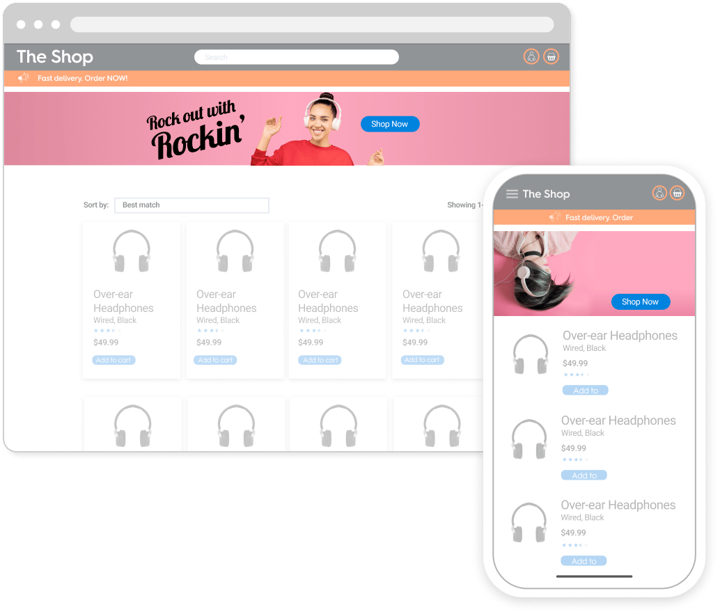
Example of the Display Panel Ad format
Technical details
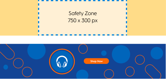
- The safe zone should remain visible for every breakpoint.
- The whole image should be clickable and should host a redirection link.
- Depending on placement size, the background image will be cropped (height stays the same):

If the placement width is equal or superior to 1400px,
the background image is displayed in full size.

If the placement width is between 750px and 1400px,
the background image is cropped on both sides

If the placement width is less than 750px,
the background image is cropped to the safe zone.
Mobile version
The creative width is equal to 100% of the parent div. It scales in proportion. When the width reduces, the height reduces as well. The background image is never cropped.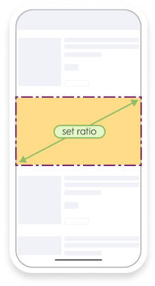
If the placement width is less than 750px, the Display Panel switches
to mobile configuration. The banner is 100% of the width
of the device, and scales the creative proportionally.
Asset sizes
Desktop
Background image sizes:1400x200pxwith a safe zone of750x200px
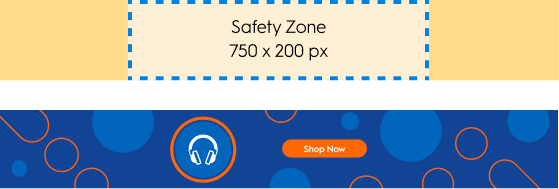
1400x300pxwith a safe zone of750x300px
Mobile web and app
Background image sizes:1350x570px1350x900px

Background of 1350x570px

Background of 1350x900px
Response keys
Field | Description |
|---|---|
| URL of Background image file for desktop |
| Alternative text for desktop background image |
| URL of Background image file for mobile |
| Alternative text for mobile background image |
| Web URL that the user should be redirected to |
| App deeplink that the user should be redirected to |
| Redirection target, can have the following values:
(only applicable for web) |