Introduction
The Branding Display Spotlight Solo is a responsive horizontal display banner consisting of a still image and a redirect link.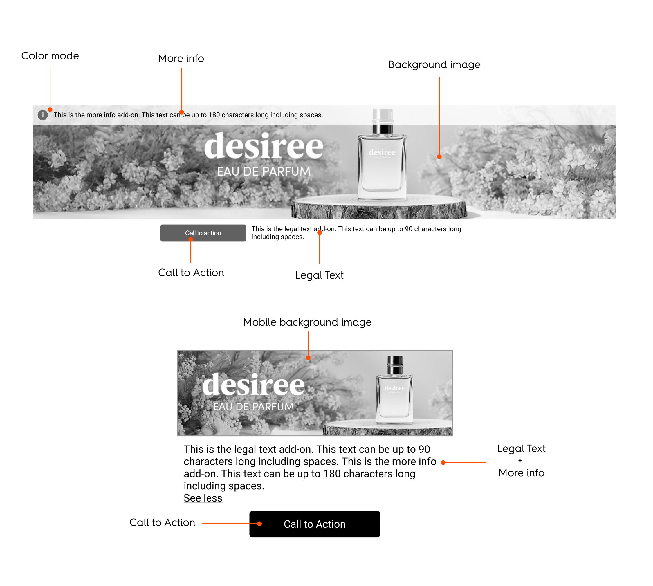
Rendering Examples
CodePen
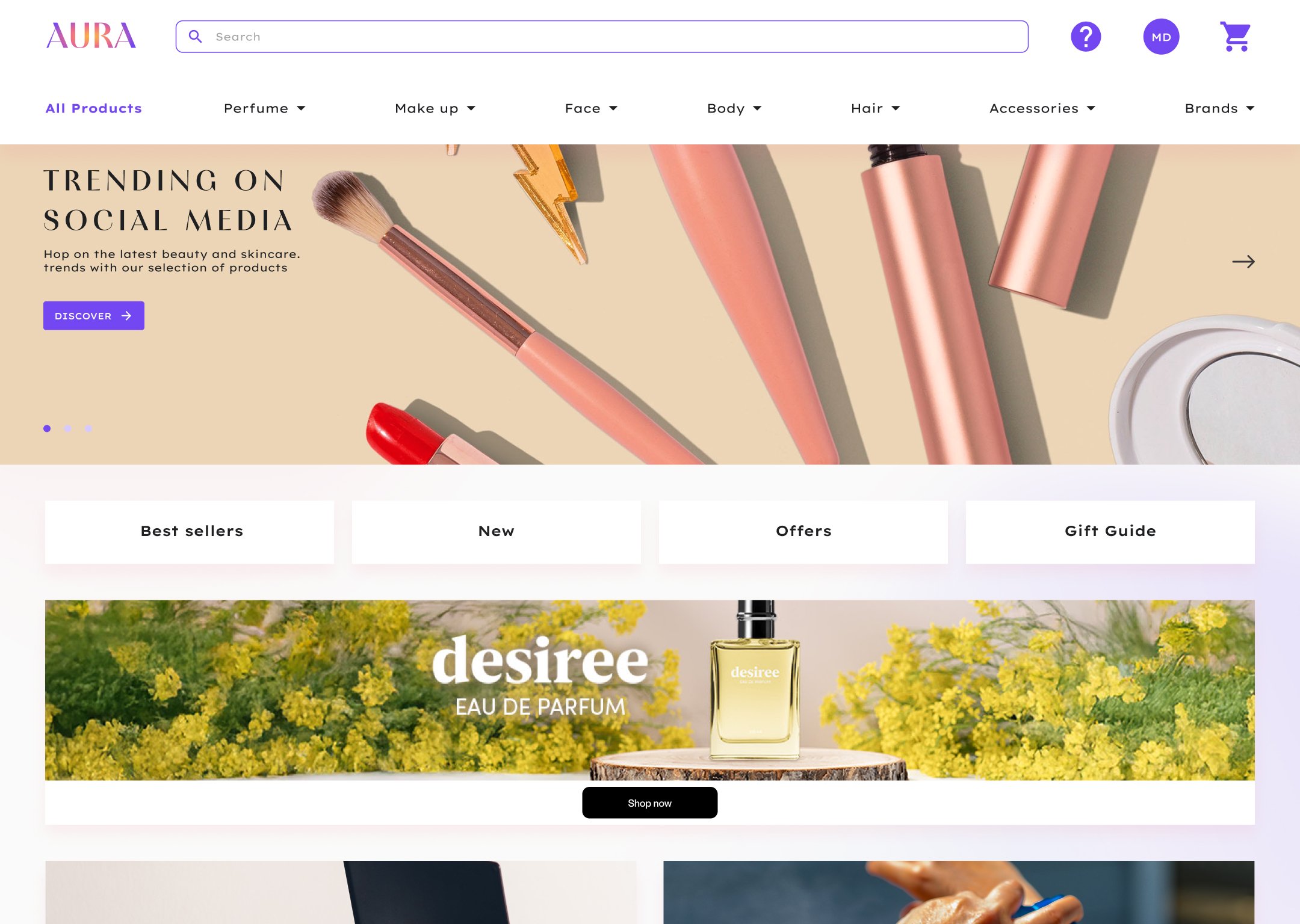
Desktop
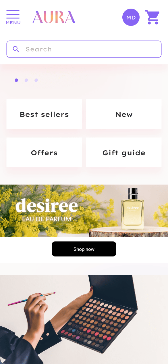
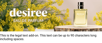
Mobile
Specifications
General
- The format can be displayed in any page but only for out-of-grid locations.
- The branding zone redirects to 1 URL.
Asset Sizes and Behavior
Desktop and Tablet Specifications
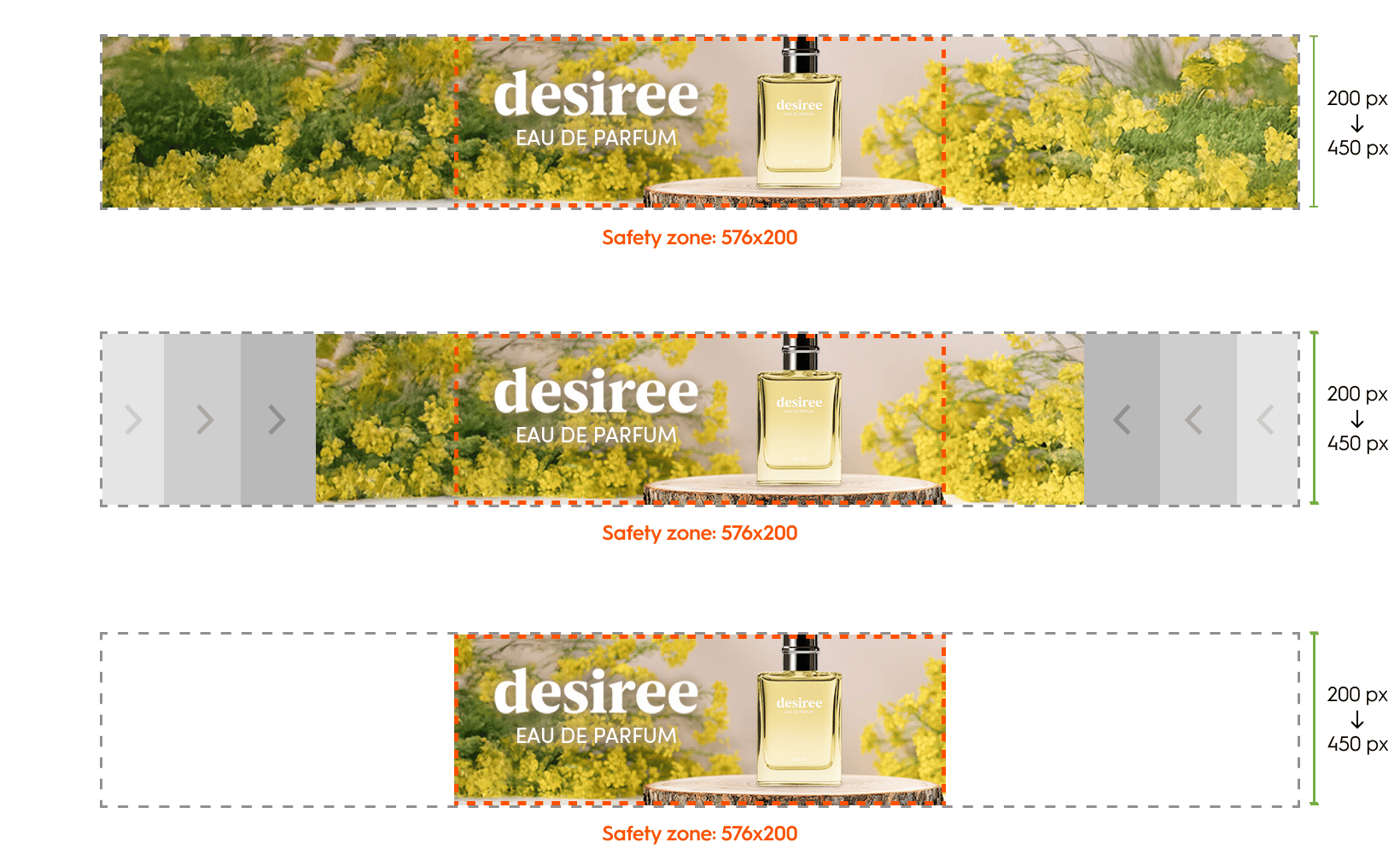
Dimensions The background image asset is 1400x450 pixels. Device Support This asset will render at its original size and can cover both desktop and tablet placements as small as 576 px wide or based on the detected device. Alignment and Cropping There is a minimum cropping area of the image asset called the Safety zone, therefore the background image needs to be centered within the branding zone and cropped on all sides. The height of the branding zone can be determined by the retailer as long as the Safety zone is respected.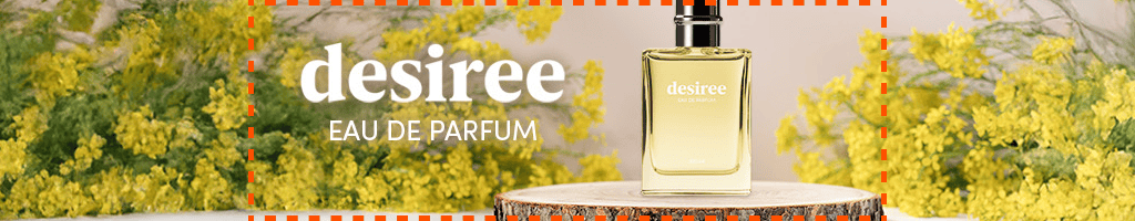
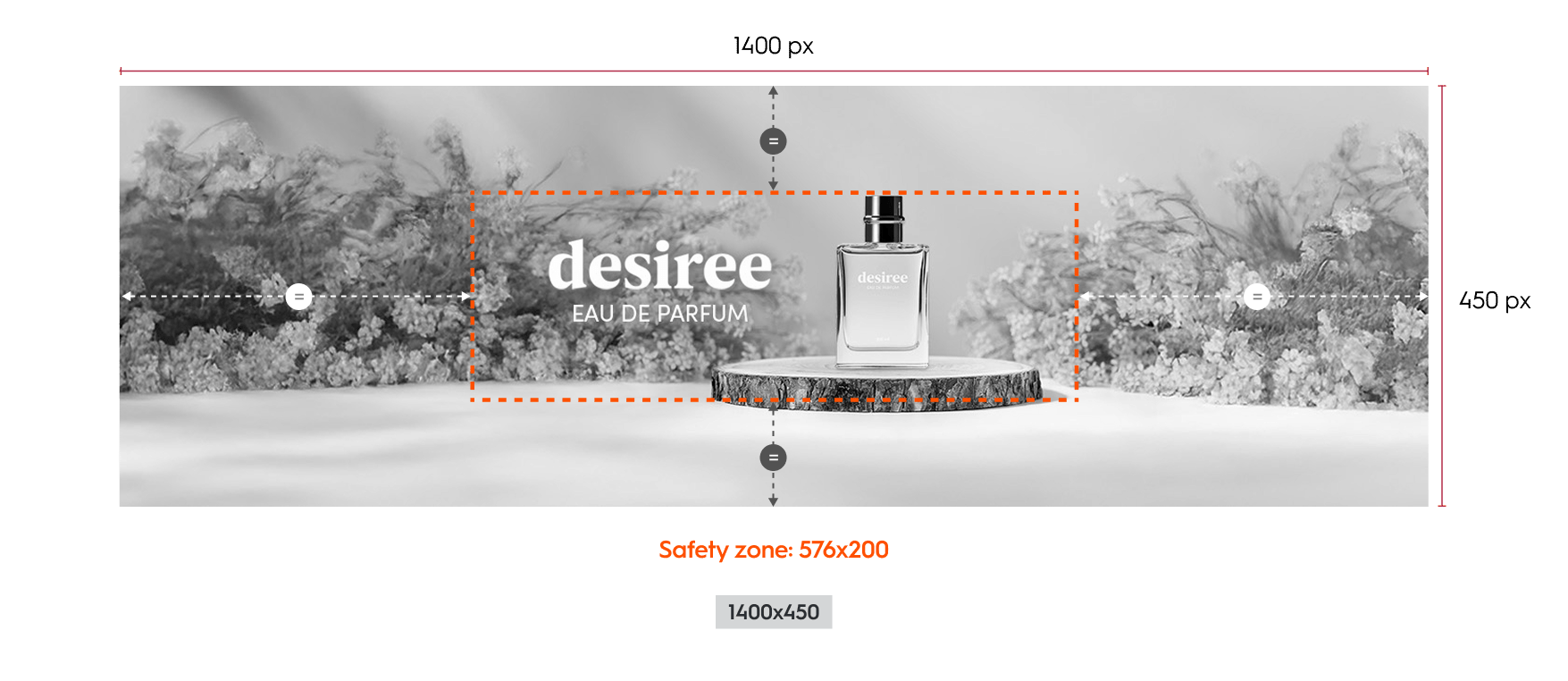
- the image can scale to 66.67% (933x300),
- and the Safety zone = 384x133.
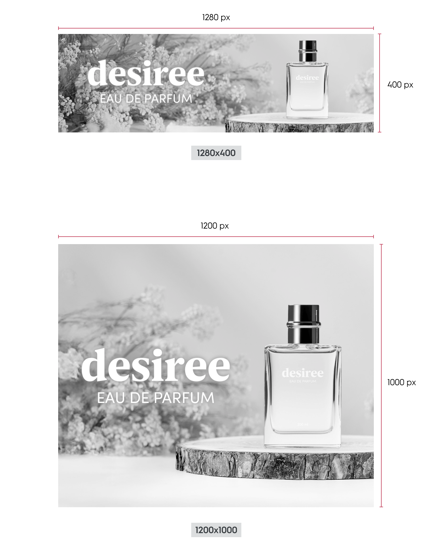
Mobile Specifications
This layout is optimized for mobile devices and high density screens. Background Image- The background image size is 1280 by 400 pixels or 1200 x 1000 pixels.
- Please note that only one of these size will be used once chosen.
- The image is fully responsive:
- It scales proportionally based on the width of its parent container.
- As the width decreases, the height decreases proportionally.
- The image is never cropped.
Available Options
The available options are adding a CTA, a legal text, a “more info” text as well as color modes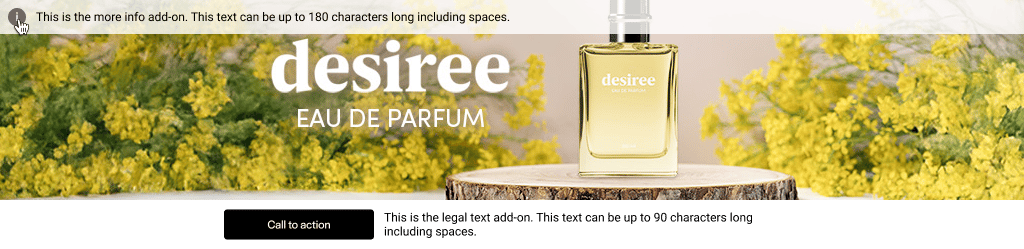
Redirection
When a user clicks on the branding zone (anywhere on banner image) or the CTA button, they will be taken to the redirection link defined within the response. There are two possible redirection options:- Self (open in the same tab)
- Blank (open in a new tab)
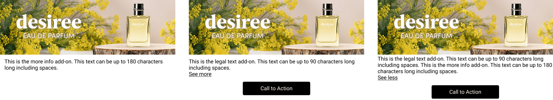
Call to Action (CTA)
A CTA button can be added as an option. If enabled, it will appear below the branding zone. When the user clicks on button, they will be redirected to the link.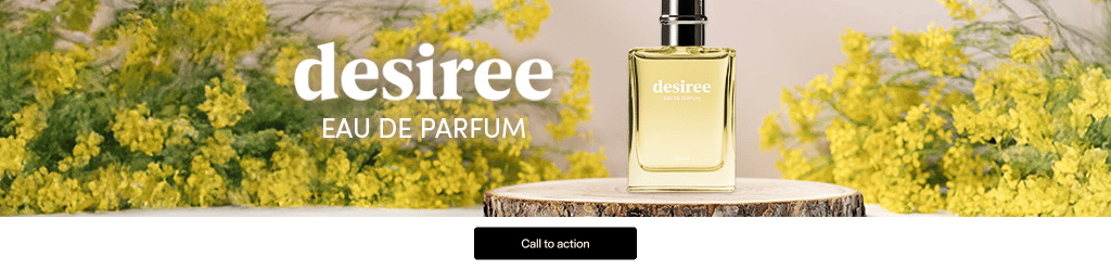

Legal Text
Legal text can be added as an option. It is always visible (90 characters maximum, including spaces) and placed below the branding zone.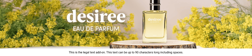
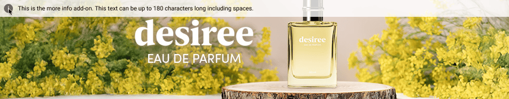
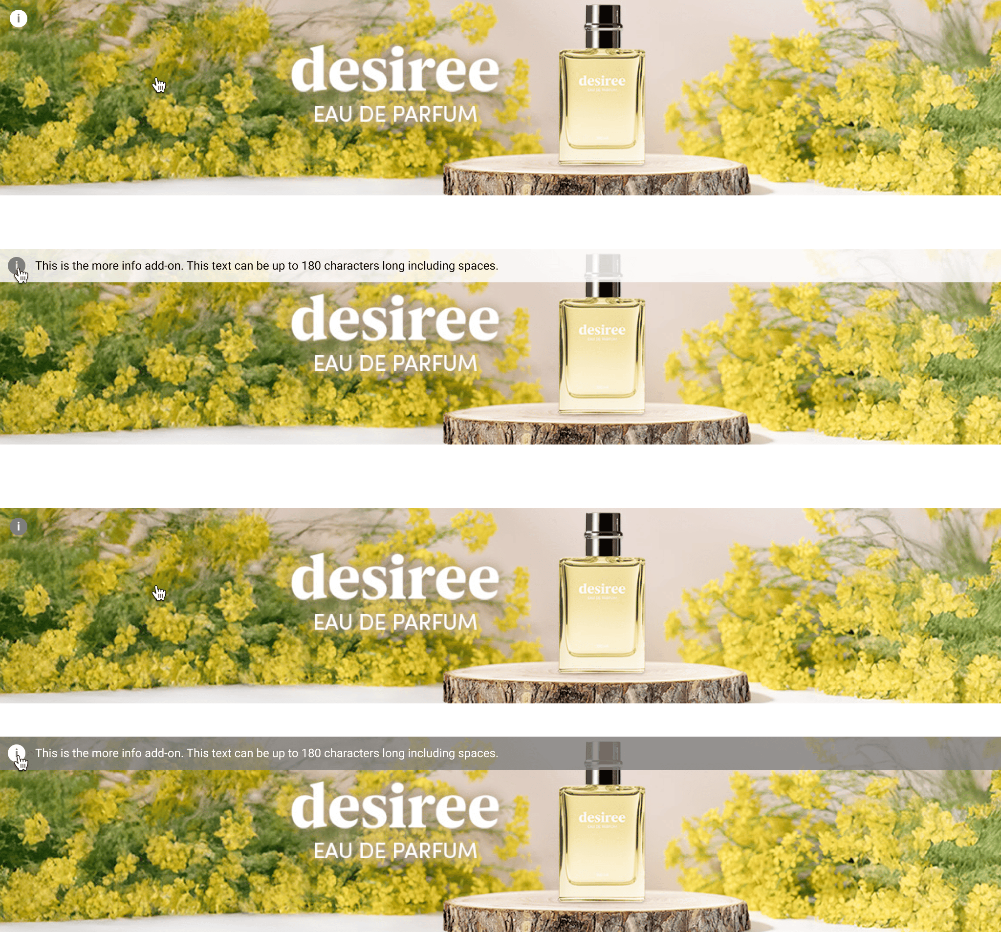
More Info
More info text can be added as an option (180 characters maximum, including spaces). If the option is enabled:- While hovering over the branding zone, an (i) icon is displayed in the top-left corner
- When hovering the (i) icon, the “More info” text is displayed on top of the branding zone.
- On mobile, it is always visible or displayed when the user clicks on
see more.
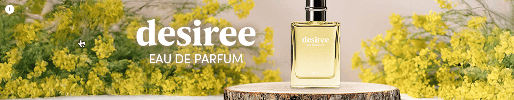
Color Mode
The advertiser can choose between two preset color modes to ensure the best contrast between text options and the branding zone. Options appear while hovering over the Branding Zone.Light mode
Background color:#FFFFFF 80%
Icon color: #6A6A6A
Legal text color: #000000
Dark mode
Background color:6A6A6A 80%
Icon color: #FFFFFF
Legal text color: #FFFFFF
Technical Details
Responsive Layout Rules
The rendering is based on the placement on the page and detected device.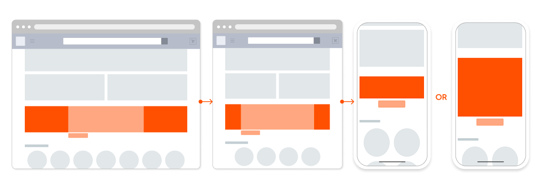
Placement width between 576px and 1400 px
- Branding Zone width is 100% of the placement.
- The height is set during integration and remains fixed between 200px and 450px.
- The background image is rendered at 100% the asset size, centered and cropped from all sides
Placement width between under 575px
- The layout switches to mobile.
- The banner spans 100% of the device width and scales proportionally, maintaining its original aspect ratio.

Styling
Element styles, such as fonts and button corner radius, are determined by the retailer and the following details shows our default styles. We strongly advise to adhere to our button sizes to keep designs streamlined and consistent.Borders
- Desktop and Tablet layout: 1px border surrounds the branding zone.
- Mobile Layout: 2px border surrounds the full creative.
Background Image
- Desktop and Tablet layout:
- The background image is centered and is cropped from all sides
- Mobile Layout:
- The background image has a fixed position and is never cropped
- It scales proportionally to fit its container.
CTA Button
- Max characters: 25
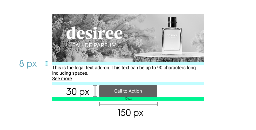
- Size: 150 x 30 pixels
- Font: Roboto Regular, 12 pixels
- Margin & Alignment
- Desktop and Tablet layout:
- 8 pixels below branding zone & below button
- When there is no legal text: Centered below branding zone
- If legal text enabled: left aligned and 10 pixels to the right of the button
- Mobile Layout: 10 pixels below navigation dots and 10 pixels below button
- Desktop and Tablet layout:
Legal Text and More Info
Desktop and Tablet layoutDetail | Legal text | More info |
|---|---|---|
Location | below branding zone (right of CTA button if enabled) | contained in interactive overlay |
Height | Dynamic, based on text length | Dynamic, based on text length |
Padding |
| 8 pixels, all around |
Font | Roboto Regular, 12 pixels | Roboto Regular, 12 pixels |
Max characters | 90 | 180 |
Background | Displayed over a colored layer (the layer color adapts based on color mode) | Same as legal text |
Mobile layout
- Legal and More info text will be displayed together
- “See less” / “See more” option for expanded or contracted view of text
- Padding: 8 pixels, all sides
- Font: Roboto Regular, 12 pixels
- Max characters: same as Desktop and Tablet layout
- Background: Displayed over a colored layer (the layer color adapts based on color mode)
Response Keys
Name (API key) | Parameters | Description |
|---|---|---|
| required: maxBytes: extensions: height: safeZoneWidth: safeZoneHeight: | Background image of desktop ad |
| required: maxChars: | Text description of the desktop background image for ADA compliance |
| required: maxBytes: extensions: width: height: | Background image of mobile ad. Alternate size allowed: |
| required: | Text description of the mobile background image for ADA compliance |
| required: | URL user is redirected to upon clicking on the CTA button |
| required: Options: | Defines whether redirection opens in the same tab or a new tab |
| required: | App URL user is redirected to upon clicking CTA from an app environment |
| required: | Text label of the CTA button |
| default: | Text color of the CTA button |
| default: | Background color of the CTA button |
| maxChars: | (Desktop) Visible next to the CTA (Mobile & app) Always visible |
| maxChars: | (Desktop) Shown on hover via “i” icon- (Mobile & app) Always visible |
| default: | Determines the contrast mode for optimal legibility depending on image brightness |