Introduction
Commerce Display Grid Shelf is an in-grid commerce display unit combining branding assets with consecutive product tiles up to the entire grid row or site width.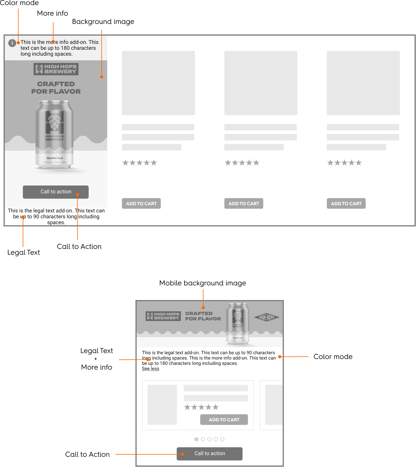
Rendering Examples
CodePen
Desktop
Rendering example for the Commerce Display Grid Shelf (desktop)
Mobile
Rendering examples for the Commerce Display Grid Shelf format (mobile - vertical and horizontal options)
Response Keys
| Description / Parameter | Description |
|---|---|---|
| required: maxBytes: extensions: width: height: safeZoneWidth: | Background image that can be used for desktop and mobile. The mobile image can be hidden through override if needed. |
| required: maxChars: | Text description of the desktop background image, used for ADA compliance. |
| required: maxBytes: extensions: width: height: | Background image of the mobile ad. |
| required: maxChars: | Text description of the mobile background image, used for ADA compliance. |
| required: | The URL users are redirected to when they click the background image or CTA button. |
| required: Options:
| Defines whether the link opens in the current tab ( |
| required: | App-specific URL users are redirected to when they click the CTA button from an app environment. |
| required: maxChars: | The label text displayed on the CTA button. |
| default: | The text color of the CTA button. |
| default: | The background color of the CTA button. |
| maxChars: | Legal text always visible on mobile and app, and next to the CTA on desktop. Typically used for trademarks, copyright, or disclaimers. |
| maxChars: | Supplementary legal or disclosure text, shown on hover (“i” icon) on desktop, and always visible on mobile and app. |
| default: | Determines whether the creative uses light or dark mode, optimized for different background hues. |
Response Example
Specifications
General
The Commerce Display Grid Shelf unit is composed of two different parts:- A branding zone,
- A product zone.
- all tiles must always be at the same size.
- if in list view or single column grid, format will change to Alternative Mobile Layout.
Asset Sizes and Behavior
Background Image Specifications
DimensionsThe background image asset is 1500x1500 pixels. Device Support
This asset can cover both desktop and mobile/APP placements based on the detected device and layout. It will not render at its original size but instead scaled down to accommodate double density screens (or higher) for improved quality. Alignment and Cropping There is a minimum cropping area of the image asset called the Retailer safety zone. This Retailer safety zone will change with each preset scaling of the asset. Both Brand safety zone and component placeholders are centered in the image, therefore the background image needs to be centered within the branding zone and cropped on all sides.

Two equal internal placeholders are used for legal text and a call-to-action (CTA) button. These are treated as margins and ensure no overlap with the Brand safety zone. Scaling Rules Depending on the device and grid size, the background image is displayed at one of the following scales:
- 26% (390×390),
- 33.33% (500×500),
- or 50% (750×750).

Grid-Based Scaling Presets
These presets define the image scale based on standard grid tile dimensions:- Mobile Grid
When the device is mobile and the tile width is between 140 and 180 pixels, and the height is between 257 and 390 pixels:
- the image is displayed at 26% scale (390 by 390 pixels).
- The Retailer safety zone is 140 px by 258 px.
- Brand safety zone is 140 px by 195 px.
- Each component placeholder is 140 px by 31 px.
- Regular Grid
For tile widths between 180 and 500 pixels and heights between 300 and 500 pixels:
- the image is displayed at approximately 33% scale (500 by 500 pixels).
- The Retailer safety zone is 180 px by 330 px.
- Brand safety zone is 180 px by 250 px.
- Each component placeholder: 180 px by 40 px.
- Large Grid
When the tile width is greater than 270 pixels and the height is greater than 500 pixels
- the image is displayed at 50% scale (750 by 750 pixels).
- The Retailer safety zone is 270 px by 495 px.
- Brand safety zone is 270 px by 375 px.
- Each component placeholder: 270 px by 40 px.

Retailer Safety zone in-grid - Dimensions for Mobile, Regular and Large grid tiles
Flexible Scaling Rules
In specific layout scenarios, the image scales differently depending on the aspect ratio and size constraints. Long and Narrow Tiles The image scales to fit the tile height if all the following conditions are true:- Tile width is between 180 and 270 pixels.
- Tile height is greater than 500 pixels.
- The height-to-width ratio is less than 2.78.
- Tile width is greater than 500 pixels.
- Tile height is greater than 500 pixels (minimum 332 pixels).
- The width-to-height ratio is less than or equal to 1.5.

Alternative Mobile Layout
This layout variant is optimized for mobile devices and single column product grids/lists and includes a horizontal product slider beneath a branded background area. Background Image- The background image size is 1280 by 400 pixels.
- It is divided into two sections:
- A branding zone at the top
- A product zone positioned below the branding zone
- The image is fully responsive:
- It scales proportionally based on the width of its parent container.
- As the width decreases, the height decreases proportionally.
- The image is never cropped.
- Products are displayed in a horizontally scrollable slider.
- Navigation dots appear below the slider to indicate the user’s current position:
- One dot is shown for each product.
- The dot representing the visible product is darker to show its active status.
- If there is only one product, no dots are displayed.

The Commerce Display Grid Shelf dimensions (alternative horizontal mobile layout)
Available Options
The available options are adding a CTA, a legal text, a “more info” text as well as color modes.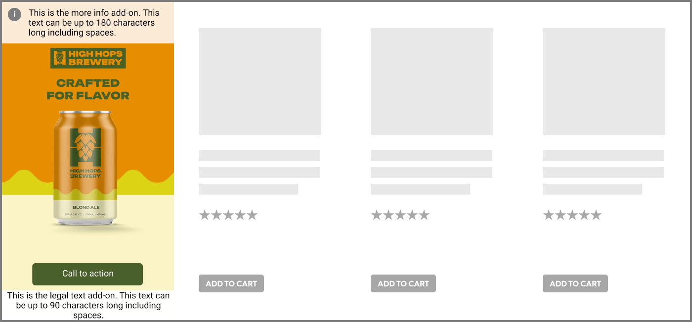
Example of the Commerce Display Grid Shelf (desktop) with CTA, legal text and "more info" text.
Redirection
When a user clicks on the branding zone (anywhere on banner image) or the CTA button, they will be taken to the redirection link defined within the response. There are two possible redirection options:- Self (open in the same tab)
- Blank (open in a new tab)
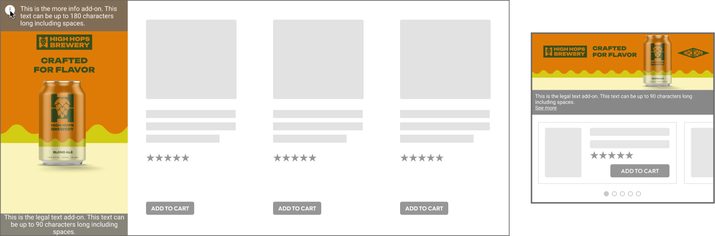
Call to Action (CTA)
A CTA button can be added as an option. If enabled, it will appear at the bottom of the branding zone or above the legal text. When the user clicks on button, they will be redirected to the link.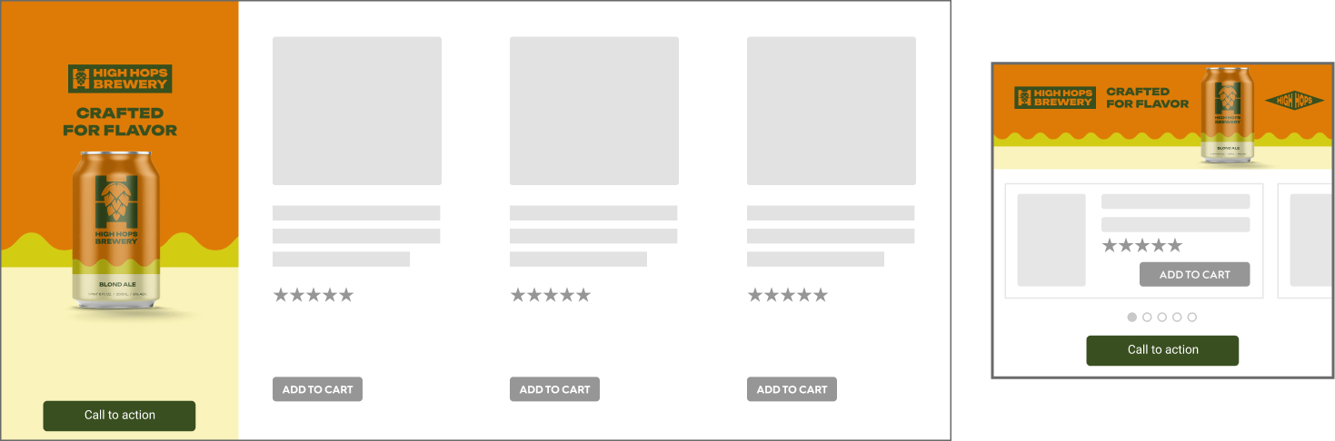
CTA example for the Commerce Display Grid Shelf (desktop)
Legal Text
Legal text can be added as an option and is always visible (90 characters maximum, including spaces).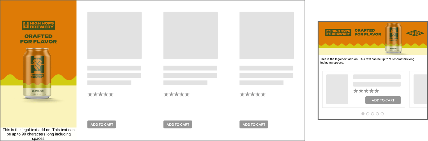
Legal Text added to the Commerce Display Grid Shelf (desktop)
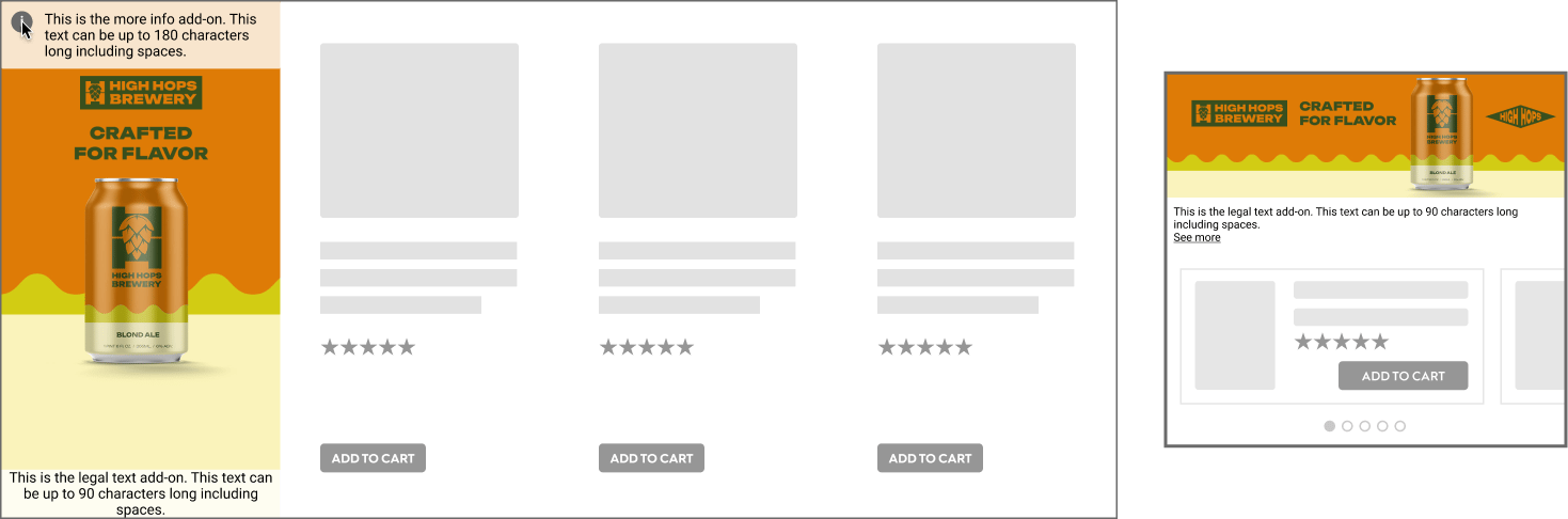
More info
More info text can be added as an option (180 characters maximum, including spaces). If the option is enabled:- While hovering over the branding zone, an (i) icon is displayed in the top-left corner.
- When hovering the (i) icon, the “More info” text is displayed on top of the branding zone.
- On mobile, it is always visible or displayed when the user clicks on “See more”.
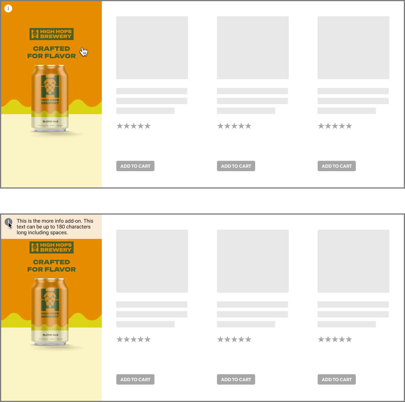
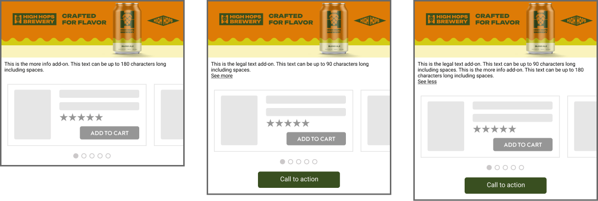
"More Info" with CTA and legal text example for the Commerce Display Grid Shelf format (mobile)
Color Mode
The advertiser can choose between two preset color modes to ensure the best contrast between text options and the branding zone. Options appear while hovering over the Branding Zone.Light mode
- Background color:
#FFFFFF80% - Icon color:
#6A6A6A - Legal text color:
#000000
Dark mode
- Background color:
6A6A6A80% - Icon color:
#FFFFFF - Legal text color:
#FFFFFF
Light mode examples for the Commerce Display Grid Shelf (desktop)
Dark mode examples for the Commerce Display Grid Shelf (desktop).
Technical Details
Responsive
The rendering is based on the grid of the page and detected device.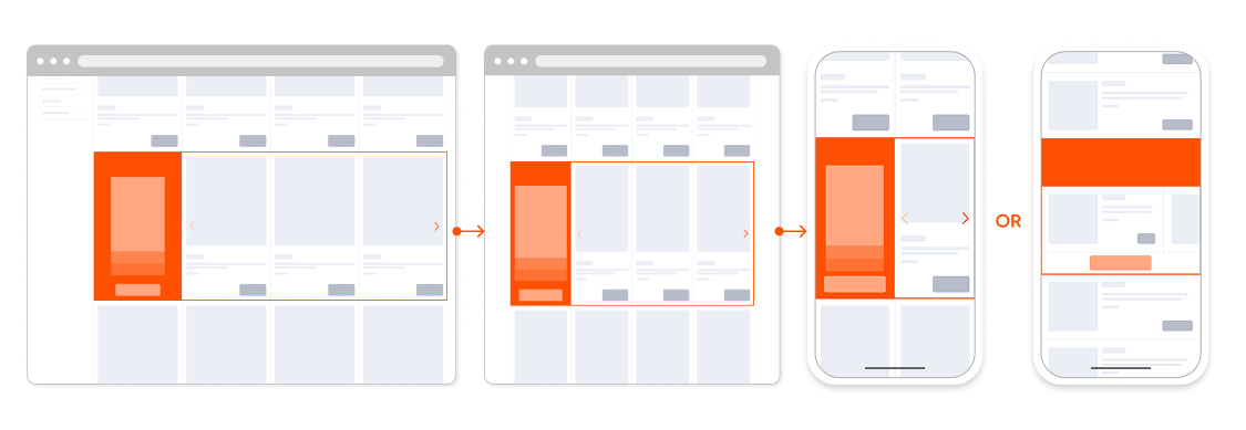
Styling
Element styles, such as fonts, button corner radius, and navigation controls, are determined by the retailer and the following details shows our default styles. However, button and text area dimensions must be adhered to so that the Retailer Safety Zone, Brand Safety Zone and component placeholders are respected.Call-to-Action (CTA) Button
- Max characters: 25
- Size: 150 by 30 pixels
- Font: Roboto Regular, 12 pixels
- Margin
- Grid layout: 5 pixels below button
- Alternative Mobile Layout: 10 pixels below button
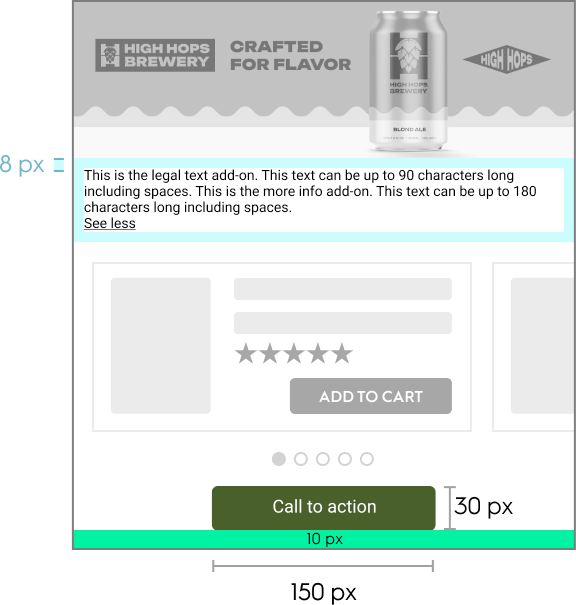
Legal Text and More Info
DesktopDetail | Legal text | More info |
|---|---|---|
Height | 40 pixels | Dynamic, based on text length |
Padding | 5 pixels on both the left and right sides of the tile | 8 pixels, all around |
Font | Roboto Regular, 12 pixels | Roboto Regular, 12 pixels |
Max characters | 90 | 180 |
- Background: Displayed over a colored layer (the layer color adapts based on color mode)
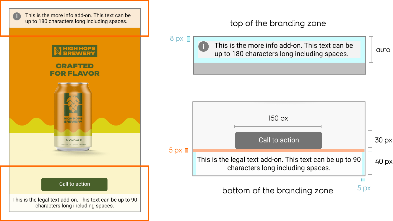
Dimensions and spacing for the Commerce Display Grid Shelf format (Web)
Alternative Mobile Layout
- Legal and More info text will be displayed together
- “See less” / “See more” option for expanded or contracted view of text
- Padding: 8 pixels, all sides
- Font: same as Grid layout
- Max characters: same as Grid layout
- Background: Displayed over a colored layer (the layer color adapts based on color mode)
Dimensions and spacing for the Commerce Display Grid Shelf format(Mobile)
Layout and Borders
- Grid layout (desktop and mobile): 1px border surrounds both the branding and product zones.
- Alternative Mobile Layout: 2px border surrounds the full creative, including product listings.
- Padding: 10 pixels of spacing around each product listing.
Background Image
- Grid layout (desktop and mobile):
- The background image is centered and is cropped from all sides
- Image size rendering is determined by grid-based scaling presets
- Alternative Mobile Layout:
- The background image has a fixed position and is never cropped
- It scales proportionally to fit its container.
Navigation and Slider Behavior
- The design of navigation dots or arrows are customizable to match the retailer’s native UI
- When the user releases the slide, the product with the largest percentage of visibility becomes the main displayed product
Product Zone Behavior
- Product information dynamically fits within the product zone
- For Grid layouts (desktop and mobile), the tile height is determined by tallest product in the row.
- For the Alternative Mobile Layout, the product zone maintains a consistent height, regardless of the width of the branded header
Alternative Mobile Layout Product Visibility Logic
-
If only one product is present:
- The product is 100% in view
-
If the viewed product is first or last in the list:
- The main product is 80% in view
- The adjacent (secondary) product is 20% in view
-
If the viewed product is in the middle of the list:
- The main product is 80% in view
- Each adjacent product is 10% in view

